Villa & design

AN EYE WITHOUT AN EYELID

  • March 20, 2024

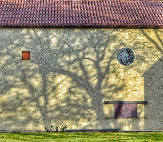
Come un grande occhio che guarda la proprietà questo infisso nasceva privo di palpebre ovvero di oscuranti. Un’enorme pralina inserita da un gigante in una glassa di cemento provoca la curvatura del muro all’interno. ‘In dolce’, come molti altri details della casa. Le immagini di una rivista in cui fu pubblicata e quelle recentissime a dieci metri di altezza, for a facelift we are doing to it, allow you to see it (and cuddle him) close.

JOE COLOMBO? REALLY?

  • February 17, 2024

The villa sometimes gives birth to rather particular pieces. Resurfaced from the cellars during a reorganization, this is attributed to Joe Colombo, about the end of the years 60. It's not the most famous of the famous designer but that cut in the umbrella stand is sooo cute. Does anyone know who made it? Leave a comment. In the meantime we add it to the collection of objects that accompany the events and that we make available to our guests, especially the so-called design addicted. Click to enlarge.

GOOD 2024

  • December 29, 2023

Greetings Happy New Year from our two kind dwarves’ (they are in fact a couple, also close-knit judging by the images) who wanted to play with some furnishings and furnishings scattered throughout the villa. The same ones who appear here and there and cheer up yours events with a mood that is sometimes refined and sometimes jaunty.

Playing is the right verb because an event, even if it were business, it must always have a leisure component, playful or, at least, convivial and gastronomic. If you then play with the design it's the best!

BTICINO MAGIC AND VILLA BORNELLO

  • July 25, 2023

They are like the Valda Pads, like fiat 500, like the Bialetti coffee maker, like the Panini stickers. They produced hundreds of thousands of them. They are the plaques of Biticino, the famous 'Magic' series plates’ very widespread over the years 60 e 70, and also produced later.

A recent visit to Mil Science Museumagain , in particular in the area in which the Italian post-war industrial and consumer development was discussed, with examples such as Olivetti,Sip, brionvega, Seleco, it allowed us to see them posing inside their showcases.

Nothing rare, Therefore, however it is nice to think that a clean and linear object that has been part of the Italian costume, del design e del Made in Italy, also peep into the villa. Under, some specimens.

Some museum dudes, In short, like ours floor tiles.


GIO PONTI'S HAND?

  • June 19, 2023

This cute object by Gio Ponti for Casa Fornaroli in Milan is cute, approximately of 1955. Our eye fell because we too…


This wardrobe by Gio Ponti recently went up for auction for the Phillips guys. Gio Ponti designed some things for the house of his friend and colleague Fornaroli, including this particular wardrobe with pass-through door. Below is the first roundup with some photos taken from auction notice. Below are the images of one of our boiseries with similar functions designed by Roberto Pamio for the villa. In fact, it hides environments and passages. And we also have the original drawings 🙂

Our particular hallway features a custom-made wardrobe. As well as containing clothes and things, leads to two environments. We also have one of this project model original of the time made by the architect on cardboard (and Carioca pastels, judging by ‘ treatment’ :-)) to better understand the development of the project and the colors.

Note the colored 'Arco coat hangers in the third image’ designed by Luigi Caramella for 'Con&With’ e, last but not least, positioned for both adults and, down, for children…

A JUMP TO THE MUSEUM. AND THEN IN THE KITCHEN.

  • March 7, 2023
UN SALTO AL MUSEO. E POI IN CUCINA.

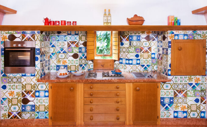
Guests say they resemble Portuguese azulejo tiles. To some they remind Provence or Sicily. But the truth is another. A tour of the Museum of Santa Caterina (Treviso) it gave us a curiosity and in looking for the fathers of these coverings we ended up at Ceramics Museum of Faenza where we found our own tiles. But let's go in order.


Giretto al St Catherine's Museum of Treviso where, between culture and popular traditions, we find a stand dedicated to The Painted City of Treviso, from the homonymous in-depth study of the decorations in Treviso over the period from the 13th to the 21st century. The accompanying text reads : ” The same taste manifests itself in the exteriors of the Treviso buildings, he also expressed himself in the interiors with the application of colors and decorations on every wall or wooden surface available, from floor to ceiling”.

At the museum and in the kitchen

Even though we don't have frescoed surfaces, we enjoyed seeing the graphic similarities between the ancient Treviso wall decorations and the hand-painted tiles in our kitchen (produces. Seagulls).

Then a doubt: being that Gabbianelli (who his own story) it is a historical and particular brand, we got to the bottom of it by discovering that our tiles are present at the Ceramics Museum of Faenza and exactly who. Seagulls he collaborated with Giò Ponti, Enzo Mari, Italo Lupi e, udite udite, also with the young designers and planners of the villa Roberto Pamio and Renato Toso.

Let's start with the Treviso museum. Here are the pictures of the decorations.

The kitchen of the Villa. Details.

The big kitchen, flanked by a very useful kitchen sbratta where we find worktops and appliances, it is studded with jumbled tiles. Where a single tile repeated several times would have donated an order given by composure and repetitiveness, here some lucid madness – which also peeks out elsewhere in the villa – he gave the order to place them at random, creating an unsettling game and colors that are still current.

Gabbianelli catalogues. Circa early 70's

Thanks to Museum of Ceramics of Faenza, to the kind director Claudia Casali and the librarian Marcela Kubovova we went back to the series ‘ Hand decorated‘ by Gabbianelli that covers our kitchen. The series remained in production for about a decade. In the 'sbratta kitchen’ instead we have the series ‘cabochon‘ designed by Renato Toso in 1973 (Studio Pamio-Toso) also decorated by hand and in which opposite angles of the same color on square tiles led to combinations (quasi) infinite. In the following images the original catalogues Seagulls. (click on the images to enlarge)

What to say? A beautiful adventure 'coated’ (it is appropriate to say) of pleasant surprises. Historical courses and appeals.

You like the design? who some pieces on the subject. If instead you want to host your own event – whether small or big – here with us, please contact us.

ULYSSES, THE WALKING DESIGN

  • October 5, 2022
ULISSE, IL DESIGN DA PASSEGGIO

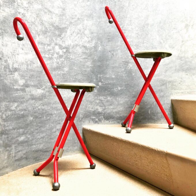
From 'design addicted' what we are, here is the latest arrival. He is 'Ulysses' designed by Ivan Loss for Sandrigarden in the early 1980s. It is a walking stool, jaunty and ideal for picnics ( quanto mai azzeccato qui nel park) trips or conversations in the countryside. Look at the 'brochure' – in those days it was called that – originale nell’immagine finale in cui ne vengono spiegati gli usi. Un pezzo iconico figlio di quell’epoca ed ora a disposizione dei nostri ospiti, anzi delle loro terga :-). E poi è pure rosso.

Ci piace lavorare al nostro particolare mood così diverso dalla sontuosità e dallo storytelling nobile delle ville venete. Noi siamo easy, sbarazzini, moderni.


SWANS AND DESIGN

  • April 28, 2022
CIGNI E DESIGN

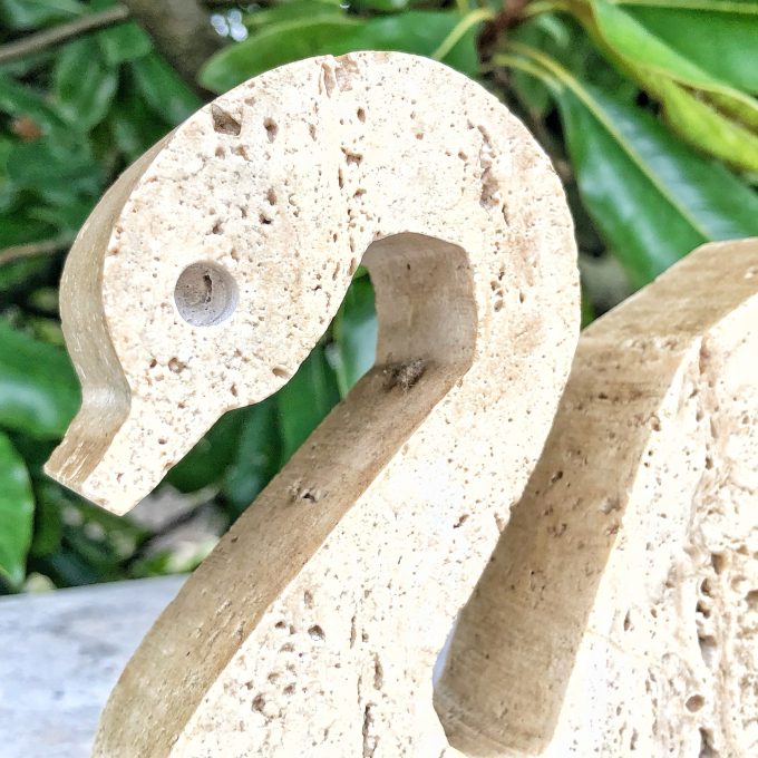
When rearranging the 'secret rooms' of the Villa you find pleasant surprises. The family of swans in travertine is designed by four hands by Enzo Mari ed Angelo Mangiarotti and produced by the brothers Manelli. Around the mid-1970s.

Experience the villa with objects from its time. Between lights, pouffs, sofas, sessions, paintings, accessories and various objects it is nice to remain consistent with the design of a house whose mood has remained intact over the decades, creating for guests and their events a little experience of architecture.

Between modern and vintage objects you are surrounded by a decidedly environment different from the classic Venetian villa, very customizable. and above all completely besieged by verde.

FIFTY SHADES OF RED

  • April 21, 2022

A company of friends. A last-minute request. A pizza on the fly.

A pizza all together, under the vaults of the villa, preceded by an aperitif on the water surface and with the tranquility of being alone.

Things that happen (and here they often happen 🙂 ) with the organization of corporate events and dinners, birthdays and the like.

As in most occasions we can't live without the thousand shades of red. You are thinking of organizing something similar? Info who

EVENT DESIGN

  • April 19, 2022


Remnants of the setup for last night's party. Like Narcissus, Magistretti's Eclipse (1965) is reflected in the pond. Because our villa is different? Because here no Poseidons with the trident, cherubs, eighteenth-century statues or frescoes. From us only Compassi d'oro 🙂

Eclipse – Vico Magistretti for Artemide 1965 – Bornello VILLA

VERNER E’ VERNER E

  • March 28, 2022
VERNER E’ FRA NOI

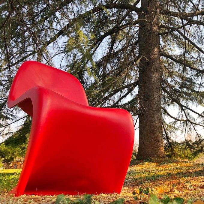
Take a seat. The iconic Panton chairs (strictly red) populate the villa and prepare to receive your B 🙂 sides . Produced by Vitra in the late 1960s and included in various design museums, were the first injection-molded chair design. It is good that they are here, for yours informal events and why cheeky as we like it. You can think of an idea for an event here? Need a tip? Write to us.

HELLO ROBERTO

  • November 26, 2021
CIAO ROBERTO

For artists, there is no detail that is small. When I met him I was struck by the good-natured vanity of the architect. Perhaps because he is Venetian, perhaps because he is an architect. Certainly because he knew he had used ancient materials such as glass or wood in modern objects from less is more. It helped that between art, architecture and design has been through every bit.

When he came to our villa, designed by him together with Renato Toso, he didn't talk about the volumes, of double heights, of the elevations, large fixtures or light. Instead, he pointed out the little things to friends and colleagues who accompanied him, the details at the time perhaps escaped the control of the client and on which he had followed the soft lines used a little’ everywhere. Finishes for which it is sometimes necessary to look under a table, leaning over a wall, pass a hand to feel it by touch. The smoothness and moldings of wood and marble, the sinuous base of the lunch bench, designed to accommodate the feet, which dialogues with the concave steps of the large central spiral staircase. Among them the terracotta tiles of the fireplace, of which we propose his original drawings, the maritime staircase, the eccentric cone, the long Venetian wall. And so on.

When I was working in a lamp components factory, I met the architect Pamio” a technician once told me, now retired. And he added : “si involved bending a metal stem for one of his lamps in three different places. I did not object with him but when I was alone with the owner I confessed that one or two folds remained in the costs, the third would make them rise. I said it was 'the stuff of architects', that two were enough and that the next meeting with Pamio would tactfully dissuade him from wanting the third, worth putting on the market a lamp with an excessive cost with repercussions on sales.” When the architect returned shortly afterwards, the owner took it from afar, depicting a lamp that was still beautiful but with a more attractive cost and higher sales. With all-Venetian pragmatism, the owner said that it was easier to sell a thirty thousand lire lamp rather than a sixty thousand one.. Pamio's answer was, the worker tells, of the following content: “the third fold is done because I design for those who want to spend sixty thousand lire.

And when one day, in the villa, sitting on his' Checkmate’ designed for Arflex, I asked him what kind of client my father had been, he replied wisely, managing to join dig, pride as an architect and esteem: ” un pain in the ass but in the end he did as I said because he liked beautiful things“.

Hello Roberto.

VENETICA. KITCHEN AND DESIGN IN THE VILLA

  • May 3, 2021
VENETICA. CUCINA E DESIGN IN VILLA

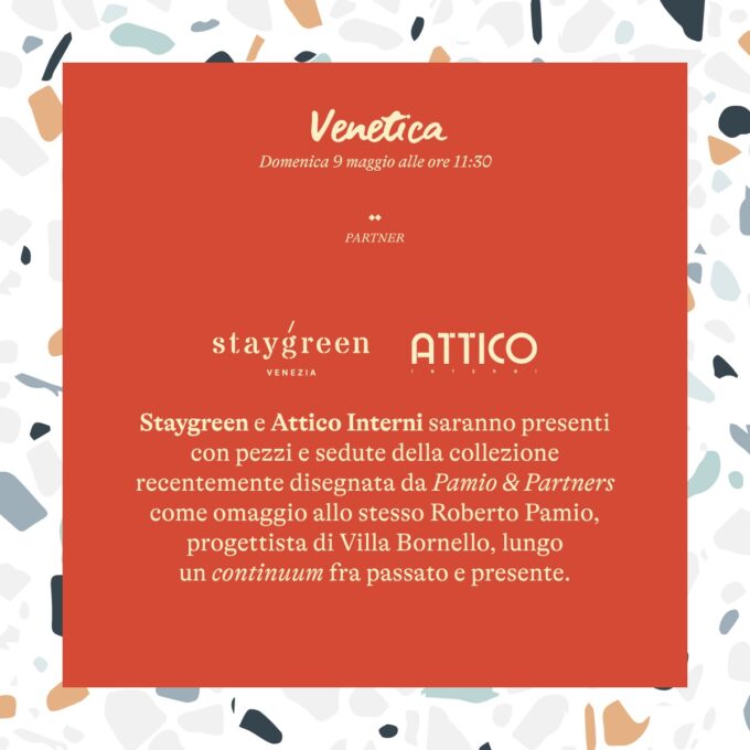
You have booked for the event of 9 May organized by the chef@stefanovocaturo? With us also friends of Staygreen ed Interior Attic with some pieces from the collection of furnishings designed by @studio_pamio in homage to the same Roberto Pamio designer of Villa Bornello, long a continuum between past and present.

The historical courses and resorts that we like ! For info 3289321333.

Limited seats. Let's go kids! Browse the invitation below

SHADOWS AT DAWN

  • April 27, 2021
OMBRE ALL’ALBA

No, it is not a photomontage. The trees are so close to the villa that the low light of dawn draws shadows on the entire east wall. Outside the breakfast rooms, the croissants with juice, pane, butter, jam and bubbling cucumber!

Ideal menu also for business breakfast which we hope, soon, to resume. 😎😜

WATER AND FIRE ACCORDING TO PAMIO

  • October 11, 2020

Searching the web they discover themselves interesting things.
Editions Di Baio. It states Claudia Molteni, about the end of the years 80.

The piece it's about a reflection on the use of water near the house. Among the architects it is mentioned Roberto Pamio. Guess which of his architectures is taken as an example.

Of Pamio the author recalls the desire to always include a mirror of water and a fireplace in her works. Water and fire, primary elements for man.

In the case of Villa Bornello they are aligned with each other and seem to look at each other. The fireplace as a family communion around the winter fire, the second as a communion around the water in the summer.

We keep the dimensional drawings of the cladding tiles of the fireplace. We talked about it who. What do you say, Roberto, recognize the hand? 🙂

Photo credits: we thank the association I Love strada Ovest which we have ‘ stolen ‘ the cover image. (and that after all they are almost our neighbors) 🙂

http://www.dibaio.com/360-gradi_22/

THE ORIGINAL PLAN OF THE PARK

  • April 5, 2020
IL PROGETTO ORIGINALE DEL PARCO

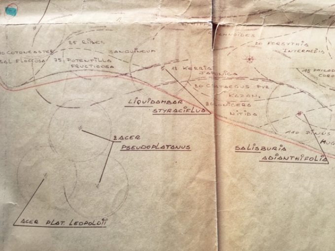
I Nurseries Priola Treviso are now known nationwide. Small but specialized. Over forty years ago they were born recently and it was they who planted villa those tall trees now almost thirty meters.

From the classic trunk in the basement they came out quotes and original documents. Not far away a roll-feed tube kept the original project Park Villa Bornello, the order in the list of the more than 2000 plants planned, the architect's bills French Bogaert.

Open a treasure chest for a carbon copy of tissue in the letterhead, invoices beaten black ribbon or red as they used to at the time, the punch variations in pencil on the project, the Latin names of plants, moving total of pound. Especially the possibility, like new explorers,  to go around the park, drawing the hand, and figure out what has changed and what is not. Compare ” the then ” e ” now the ” a living organism like a garden.

Tranquilli, it's all fairly faithful. Although the project from those 2000 plants immediately went down to a little more than three hundred, many of which come down to us. The park It rises gradually from the city walls and is one of the rare examples of large residential park in the municipal urban belt. The house there is literally immersed so that the connecting link between the two worlds is constituted by the particular pond. Place of business meetings and events ceremonies generally, The villa is one of the few cases in the area, perhaps the only, of rental’modern architecture event. And not just for 😉 events

You have an idea for an event?

let's talk about.

Nasko LORIS, AN ICON OF DESIGN

  • December 12, 2019
NASKA LORIS, UN’ICONA DEL DESIGN

Jac Jacobsen (1901-1966) It is the father of Luxo, which later became Naska Loris, the famous lamp 1937 become a design icon much to also be mascot of the famous production company Pixar since 1986.

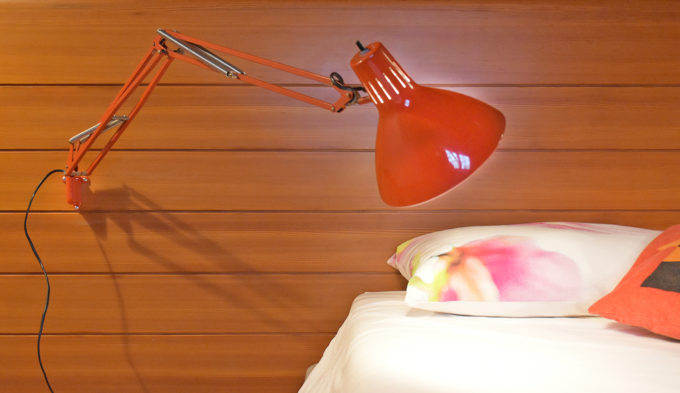
The villa it houses some. They were at the time you think, and they are used even today, both bedside and as leading lights in the ceiling instead of lamps and the like. In the photo you can see the cheeky and colorful Naska Loris original of the time still faithfully in place. Everything reflected and still reflects the architect's original intention today.

But what is their being ‘ cheeky’ and at the same time an archetype? Barbara Canoci, who writes, comes to our aid: ” here it's unveiled the mathematical law behind all lamps with spring-balanced arms.

This is the 'application of the so-called "articulated quadrilateral", in which the sum of the shorter rod lengths and the longer one is less than or equal to the sum of the lengths of the other two rods.

In reality, the arm of this kind of lamps is formed by two articulated parallelograms coupled, ie by two articulated quadrilateral in which opposing rods are of equal length, and consequently always remain parallel to each other. That is why the lamp in question can be moved in up-down and forward-backward without changing the reflector which always moves parallel to itself. https://www.home.vintag.store/post/le-forme-di-jac-jacobsen-leggi-matematiche-e-luce

Simple, no?

YOU ARE WELCOME, Let's sit

  • May 25, 2019
PREGO, SEDIAMOCI

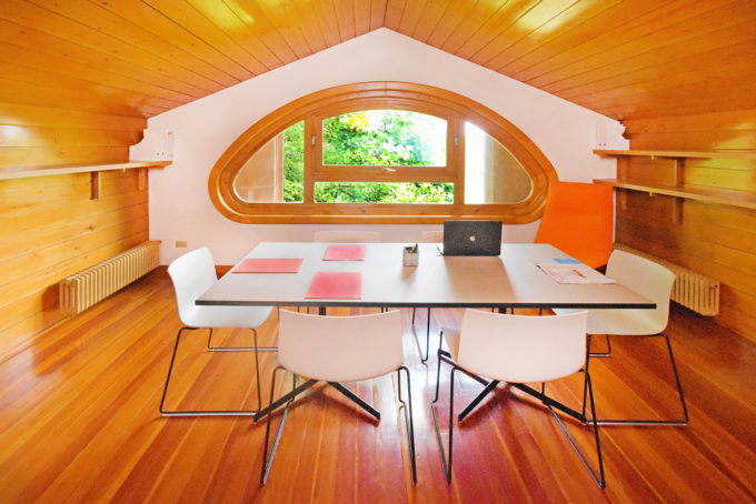
One of meeting rooms of the villa. Different environments are suitable for business meetings, you want them informal you want institutional. To achieve corporate events here allows you to live different experiences simultaneously. Guests at a corporate event can split between a formal meeting or a buffet, can stroll through the park or go to one of the office furnished rooms (like this) to meet in private. And they don't have to share these spaces with anyone else. This is one of the two attics. From this particular window you can enjoy a splendid view of the greenery. Here you can speak undisturbed, take advantage of the network or have you bring a coffee. 🙂 two meters from the sky.

Credits: Meety table and Catifa chairs by Arper.

CORPORATE EVENT?